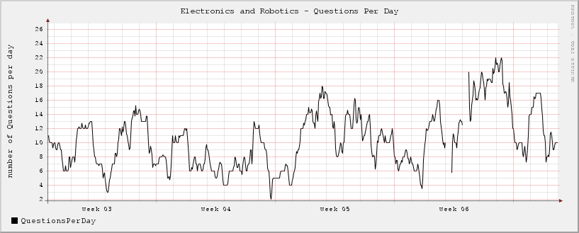
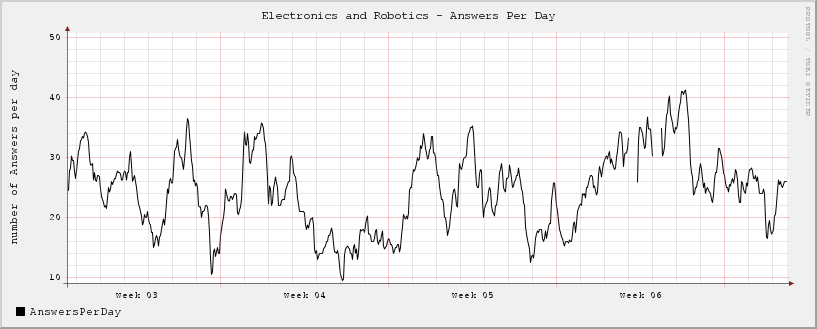
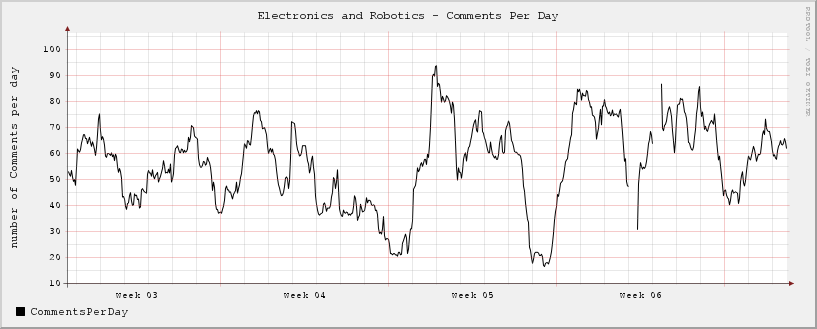
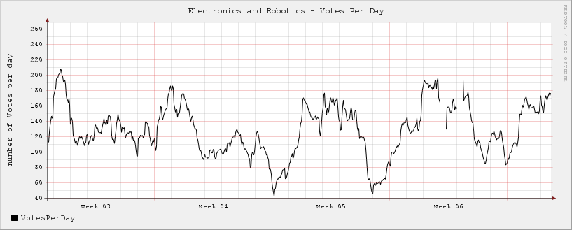
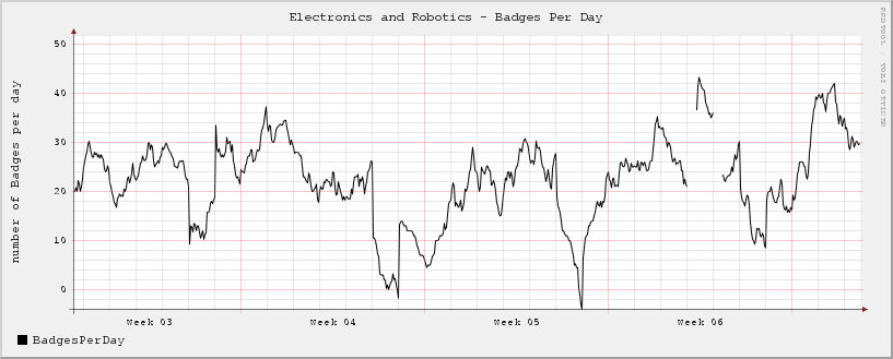
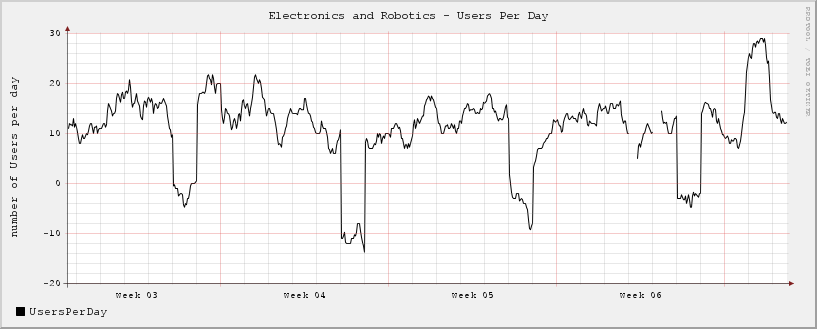
I'm using the E&R API to collect usage stats and graph the data. Here is what I'm come up with so far. It's only been running for a couple of days, so not much data yet... I'll update in a couple of days with more data. Also, the times are GMT as I'm in the UK!
Does any body have any ideas of other ways to visualise this data?
Graphs Updated: 16/02/11 18:20 GMT - last 4 weeks
Note: I think there is something strange going on with the API stats data for users!
